
I interviewed product team members who had concerns regarding the sign in experience. I conducted an Analytics Review and found that the sign in page at Kansas State University receives the second highest amount of traffic, trumped only by the universities home page. I conducted Task Analysis, Expert Review, and Cognitive Walkthrough exercises to understand the various associated interfaces and prompts, and what problems users might face. I then conducted Competitive Analysis to evaluate user expectation, and designed a new experience adhering to usability heuristics. I worked extensively with developers to implement all changes.
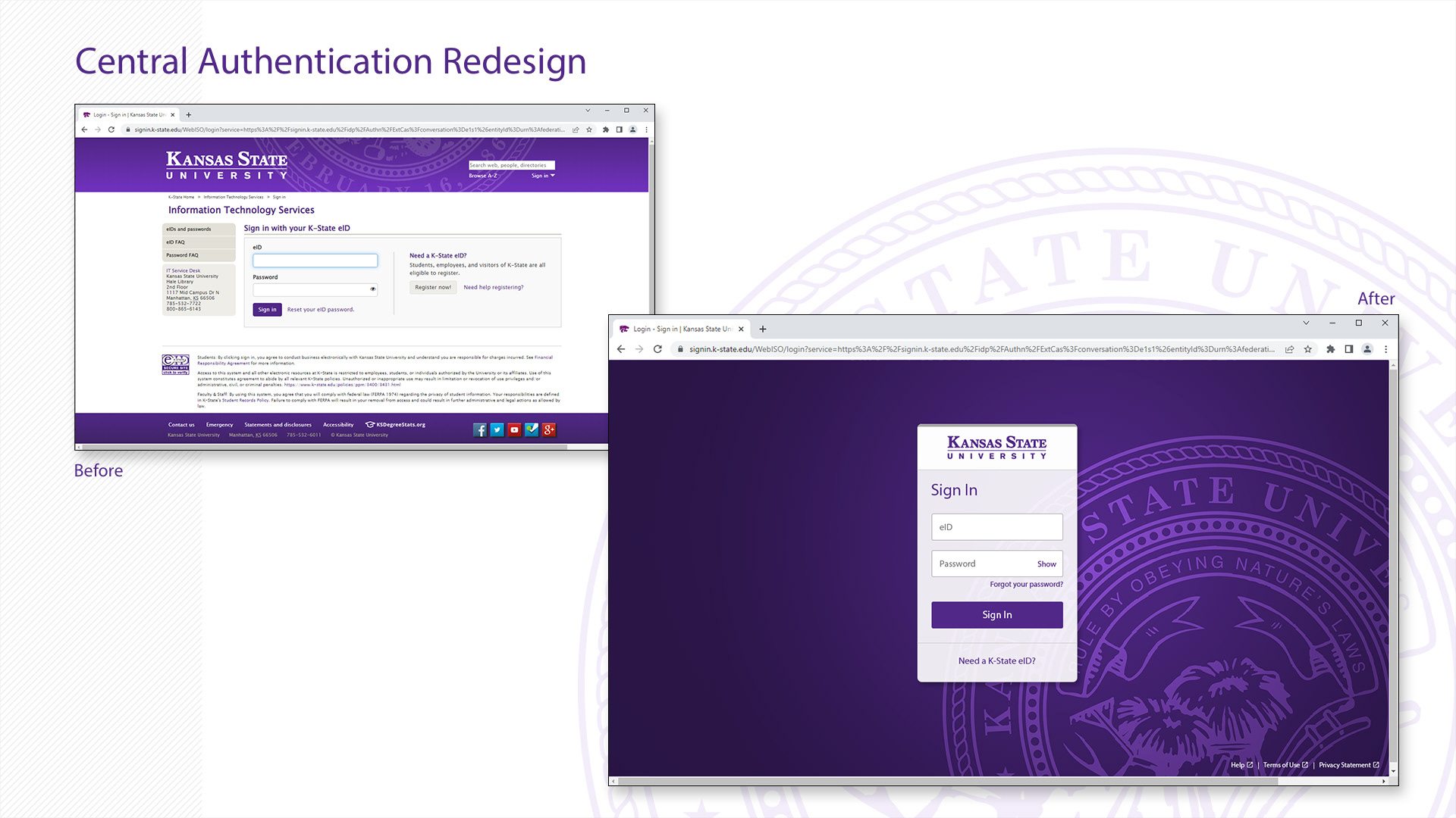
The previous sign in page was crowded with unhelpful information and was visually unappealing. With the redesign I improved the usability by removing all unnecessary information and made it more visually appealing by modernizing the styling.
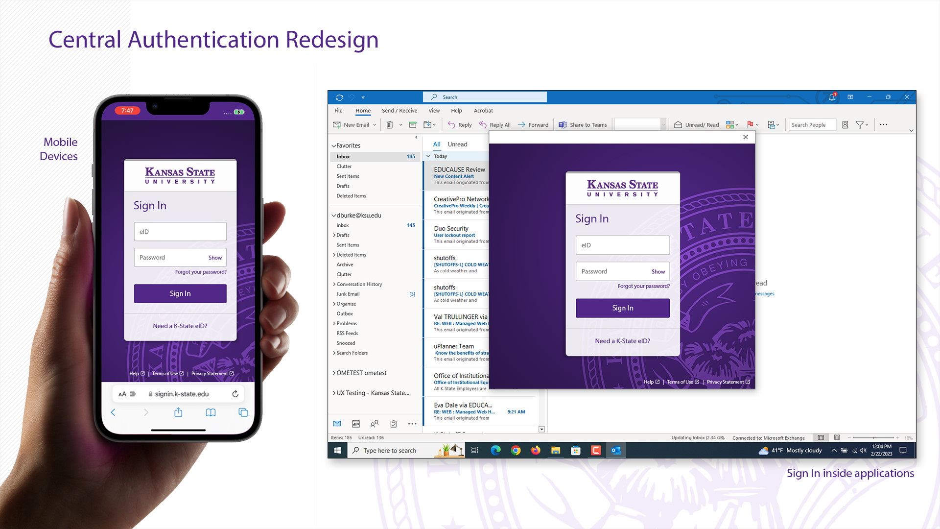
Ensuring the design was responsive to various screen sizes and devices was a key part of the project.